Contents of Article
- Summary
- Why design is important with infographics
- Can infographics help educate people?
- Can infographics make learning fun and engaging?
- Can infographics help sports coaching?
- Conclusion
Summary
Over the past few years, infographic production and usage have grown drastically. This is because they are one of the most preferential learning mediums available [1]. Coaches and athletes seem to be using them for their own education now more than ever. It’s hard to say exactly why infographics are so popular, but theory [1] suggests it is because of the following reasons:
- Humans are visual animals
- Humans have shorter attention spans thanks to smartphones
- Humans absorb information faster with corresponding graphics
- Humans easily forget what we’ve read but remember what we’ve seen
- Humans tend to be triggered emotionally by images
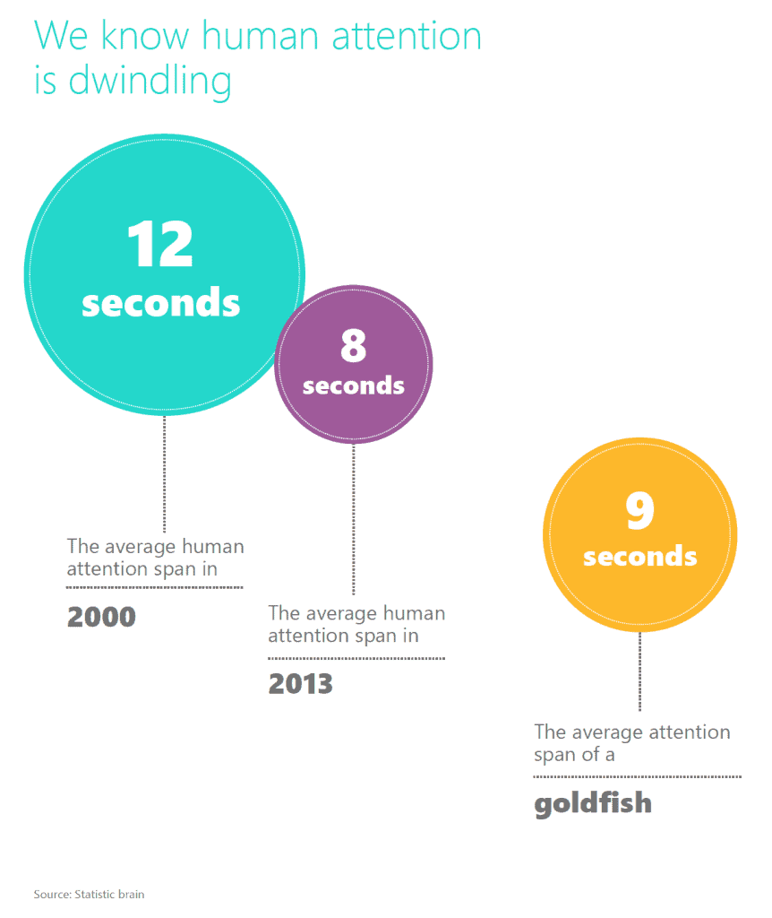
Since we moved out of the ‘Industrial Age’, into the ‘Information Age’, and now into the so-called ‘Digital Age’, we’re immersed in information virtually 24/7 – there’s practically no escaping it. This has led to the suggestion that our attention span has reduced from 12 seconds in the year 2000 down to eight seconds in 2013 (Figure 1), however, there is no legitimate evidence to support this assumption.
Regardless, it’s probably fair to say it’s becoming increasingly harder to engage a person’s attention due to the sheer volume of stimuli they’re exposed to every day. This is partly why infographics have begun to dominate how we educate both ourselves and our athletes. Put simply, infographics enhance coaching because:
- Beautifully designed (for the most part)
- They cut out the jargon and make complex things easy to understand
- They make learning fun and engaging
Why design is important with infographics
For the majority of infographics that wind their way onto our social media feeds, they’re typically very well designed and contain powerful content – hence why the algorithms show them to us because they managed to generate engagement. This is great, and makes consuming tough information (e.g. research and data) much easier to learn.
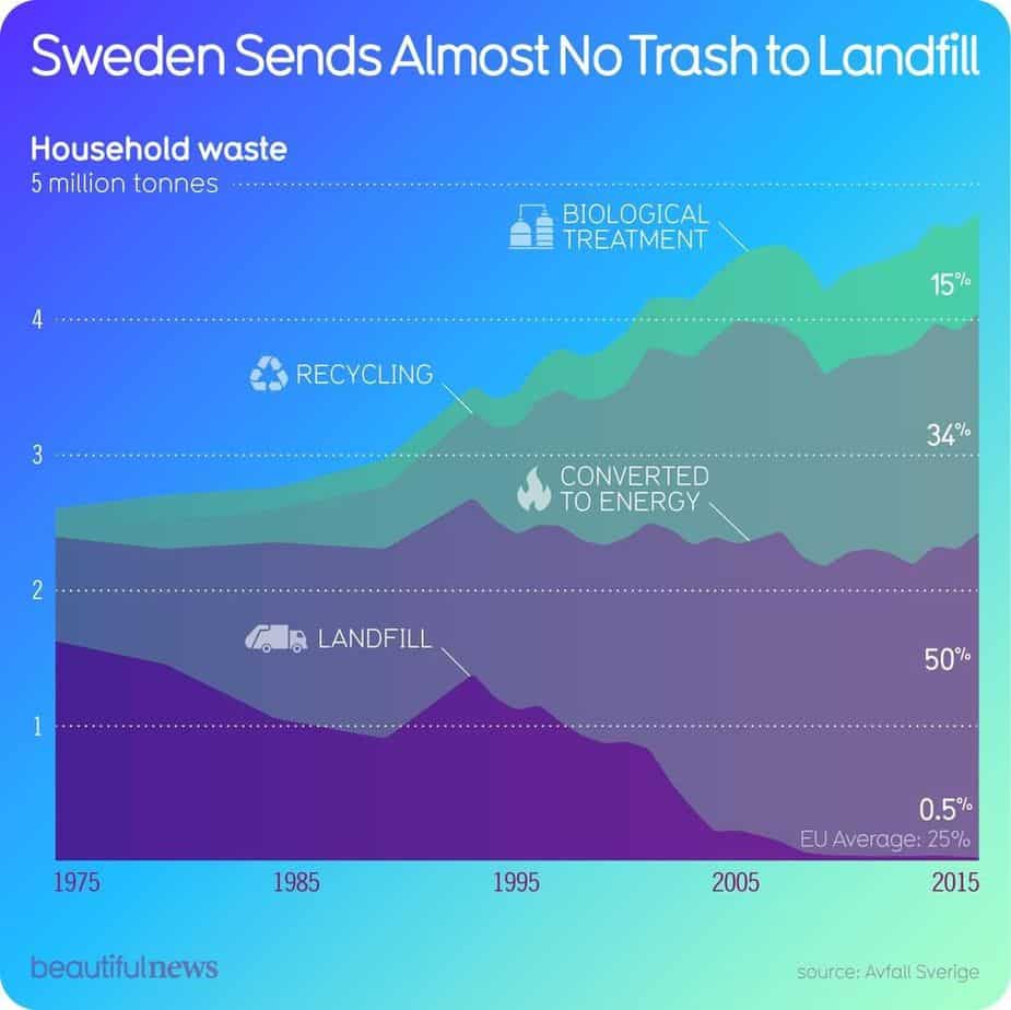
Have a look at these elegantly designed data by @beautifulnews on Instagram.
Can infographics help educate people?
Due to the limited space available, infographics demand that virtually all of the jargon is completely cut out. This can be great as it leaves us with the truly important pieces we need to consume. This is something we pride ourselves on here at Science for Sport and is actually at the heart of our mission statement. We want to provide coaches with trusted and easy-to-understand sports science information.
However, this is a dangerous double-edged sword and infographics can be at the heart of it.
Single-study infographics are extremely dangerous…
Whilst we will admit that we’ve produced some single-study infographics in the past, it’s something we decided to stamp out entirely.
Let me explain…
Not all research is created equal. Some research is great, unbiased, and has robust methodologies. Others, unfortunately, do not and can even be funded by self-interested organisations. This can, therefore, become extremely problematic when people are producing single-study infographics that are biased, poorly controlled, self-funded, and the list goes on.
Here’s an example of a single-study infographic…
In addition, when it comes to single-study infographics, they don’t give a balanced understanding of the whole picture. For example, study A may have found X results but study B may have found Y. This means when viewing single-study infographics, they’re only really showing apples versus oranges and not gaining a full appreciation of the robustness of the studies.
If the infographic is created using compounded information from a variety of research, a meta-analysis, or a systematic review, then there is a higher likelihood that the information is balanced and shows the bigger picture.
So, the take-home message here?
Be very cautious if trying to learn from single-study infographics and that’s why we’ve completely moved away from creating them.
[optin-monster-shortcode id=”zmduwq9qz4orwfm5dng4″]
Can infographics make learning fun and engaging?
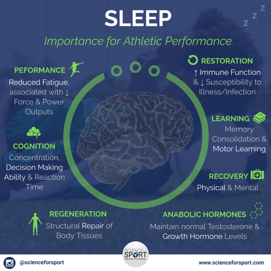
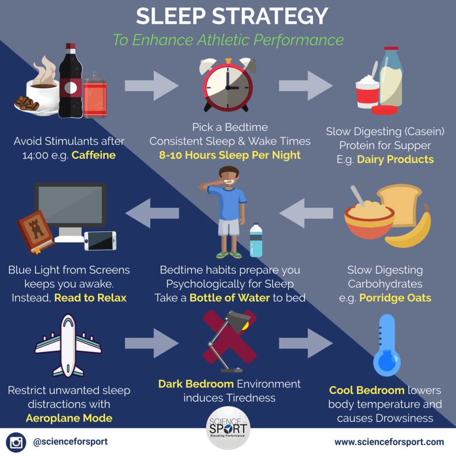
Coaches, athletes, and parents alike all love infographics. And rightly so, as they make learning both fun and engaging. Who would’ve known that it could be so engaging to learn about the importance of sleep for performance (Figure 4) and practical sleep strategy tips for athletes (Figure 5).
As a coach, it’s your job to ensure your athletes are educated by trustworthy, high-quality information. This can be tough, however, due to the amount of inaccurate information flying around social media.
This makes it extremely important to:
- Teach your athletes to develop their own ‘bullshit detectors’
- Guide them to quality information sources
Can infographics help sports coaching?
Our primary goal as coaches is to provide the best possible service we can to our athletes, but with the modern complexities of life (e.g. time availability, financial management and work-life balance), it can feel like this is becoming increasingly more difficult and frustrating.
Plain and simple, infographics help coaches better serve their athletes.
Here’s why…
Because of the concise nature of infographics, they help to educate both coaches and athletes on a topic in a very short timeframe. This enables the coaches to do all of the following:
- Reduce the amount of time they spend researching and learning about new topics, and thus, improve their overall learning efficacy (i.e. learning power).
- Because of the increase in learning efficiency, coaches have more time to direct towards other things such as: writing better training programmes, spending more one-to-one time with their athletes, freeing up more time to spend with family and friends, and even acquiring new clients/athletes.
Conclusion
Infographic popularity is on the rise and they show no sign of slowing down. They’re fantastic for coaches in the busy modern world where we’re drowned with information every single day and just need to cut through all the crap out there and get trustworthy and concise summaries. Infographics enable coaches to multiply their learning efficiency which, therefore, enables them to spend more time doing things they love, such as hands-on coaching and/or enjoy a better work-life balance.
- The Visual Marketing Agency. 2017. The State of Infographics [2017]. [ONLINE] Available at: https://infographicworld.com/project/the-state-of-infographics-2017/. [Accessed 19 December 2019].